
So a few days ago I went over to the USC games department (yes, it looks like you imagine: arcade machines in the hallway and always someone hopping to class on a pogo-stick in the background) and gave a lecture to their tabletop RPG design class (yes, USC has a tabletop class) on visuals in RPGs.
It was fun and signs point to "they liked it". For the benefit of y'all here are the basic talking points--longtime readers will recognize some familiar takes.
 |
| Anybody recognize this guy? That's right, the Githyanki! Why? He's still around and popular... |
 |
| Here he is, still in modern D&D. Why? Because he looked cool on the cover of the book. That's the only reason! How do we know?... |
 |
| ...because here's his almost-identical brother from the Fiend Folio, the Githzerai. Muchhhh less sticking power. (though still around--WOTC doesn't toss away IP) And what's the difference? Only the picture. |
 |
| Warhammer was kinda different than D&D--but then so was Runequest, Tunnels & Trolls, MERP & a billion other fantasy games. What really set Warhmmer apart? The beautiful art--with very specific designs like that mohawk dwarf, who appeared only a few years ago in the Hobbit movie |
 |
| Eberron's art had a task to do: make robots ("steel golems") and steampunk stuff look like D&D. And they did it: these folks look like they could be next to a knight or a wizard. Mission accomplished. |
 |
| Here's a space guy from Traveller. Traveller was a great system and got to the "epic space RPG" space first (Metamorphosis Alpha was the first sci fi game but less epic). It should've been the game for people who liked Star Wars. BUT...the art was so generic. It didn't catch peoples' imaginations. |
 |
| This guy on the other hand...everyone knows the RIFTS system sucked, but the designs were original, and Siembieda and Long's artwork made sure they felt concrete and toyetic--even if you don't like the art, it's easy to reognize this guy, the psi-stalker, the skull-walker as things specific pieces of IP that other post-apoc and genre-mash games don't have. So the game is still around. |
 |
| An old Games Workshop ad from Dragon Magazine. I am not joking when I say these were often the best things in any given Dragon issue. The designs and The Design were head and shoulder(pad)s more thought out than the stuff around them. The space marines are very distinctive, designed with the tabletop in mind, and the overall look of the ad combines branding and world-building into one activity. These sci-fantasy postpsychedelic color schemes really helped set them apart before the grimdark took over entirely. |
 |
| A Warhammer 40k design. Jess Goodwin's task: make people want to play a dancing elven space clown. And, goddammit, he succeeded. 40k not only had nice art, it had those specific pieces of design: the chainsword. The jump-pack. The harlequin. The space marine. These are non-transferrable pieces of The Look. |
 |
| Like RIFTS, your instructors here at USC will be ragging on the game design of Vampire: The Masquerade all semester. But Tim Bradstreet's art built and then sold this game so well--especially to women--that people just figured out how to play without the rules. Teacher in front row: "That image is burned into my brain" "Yep, and it's burned into the brain of every indie game designer, that's why the art on Monsterhearts and Apoc World looks just like this but worse" |
 |
| Now we're moving on to the bad examples: So this is the first D&D book--it's basically a zine. On the left we have class descriptions, then... a page about item costs? Characer gen doesn't pick up again til the next page. But what do you want? It's a cave painting. |
 |
| Fast forward 40 years, they have a graphic design budget..it still sucks. On the left it takes FOUR PARAGRAPHS to say what a "fighter" is... |
 |
| And say you wanted to make a fighter...you die midgame, try to make a new PC. Half the things you get are here and... |
 |
| ...you gotta turn the page to get the rest. Interpol agents can tell you horror stories of finding the mangled fingers of graphic designers who tried stuff like this at LotFP found littering the Finnish countryside. |
 |
| Kinda useful tables here in the 5e D&D Dungeon Master's Guid... |
 |
| ...and since these tables aren't grouped together or color-coded I had to draw an arrow to each one along the (disintegrating) page-edges |
 |
| The standard TSR dungeon map is actually a nice piece of design, there's a set of standard symbols (trap, secret door, rubble, pit, etc) that you can draw and so sit at your desk all day in math class just making up dungeons. The only problem is... |
 |
| ...when they key the dungeon and they refer to these massive useless larded paragraphs. If the players are listening at the door to room 13 are you gonna want to scan all that before you tell them what they hear? DM's books are like cook books: they are used at speed and under pressure and require special unique design consideration. |
 |
| Fast forward 40 years and surely module design has imp...nope. |
 |
| They even put a page turn right in the middle of a scene. As for how these things link together? A visual map is totally eschewed in favor of more paid-by-the-word lard. |
 |
| Now some good examples of info design: the Call of Cthulhu character gen pages. You can run your whole group through character creation using this spread. |
 |
| Where info design and game design merge: to determine where your grenade lands, drop a die onto the picture of the tank. Yes, I stole this concept for Vornheim--and btw it works because you aren't doing it on every single die roll. If you were you'd get real sick of it. |
 |
| Jez Gordon's Qelong map--instead of little color codes saying what the terrain is, the map looks like what terrain is there. You can sit in one hex and the GM can tell you what you see over the horizon in adjacent hexes. Yay! |
 |
| Carcosa hex descriptions: something in each hex! 2 things! Separated by a divider. Easy to read. Short sentences. To the point. Many entries are boring--it doesn't matter, because you are giving people a landscape to have adventures over, not trying to describe it all in useless detail. |
 |
| This is just me proving that you could fit all of the Keep on the Borderlands on three spreads: one for the Caves, one for the wilderness, one for the Keep, and maybe like one spread w. the treasure on it. You just saved like dozens of pieces of paper. |
 |
| Dr Doom's castle--an excellent FASERIP map. On the right all the info on all the rooms is listed. I've used this as SO MANY different castles. |
 |
| The Monster Manual format is actually a good pice of design--it acts as its own index and its easy to find things. Its not perfect in its original form, but it was a good precedent. |
 |
| the blue and the red are notes I added to the standard Night's Black Agents character sheet--literally all of the character creation rules for the game can fit on the sheet. |
 |
| Kirin Robinson's wonderful Old School Hack is an example of simple graphic design tools (standard fonts, too) used to make rules clear, accessible, readable and concise |
 |
| Many lifepath character gen systems have a "from here you can go here or here" format. Rogue Trader realized you could visually map it--from each node you can go down to the next register to any adjacent node. It helps the group identify commonalities--like we can see a lot of the PCs have "fortune or exhilaration" in common--so the GM could build and adventure around that. |
 |
| All over the world, people know how to paint their Chaos warriors all chaosy. How? |
 |
| ...the grimoire-like and aggressive and aggressively-specific aesthetic of the original Realms of Chaos books, that's how |
 |
| Luka Rejec's excellent one-page-worm-dungeon. Its missing some detail but how many pages would it take TSR or WOTC to do just this? |
 |
| The Original One Page Dungeon: Michale Curtis' Stonehell. Efficiency is beautiful. Efficiency is art. |
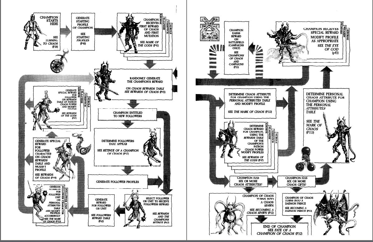 |
| Making a chaos champion looks fun, amirite? |
 |
| So to walk y'all through the process, I am gonna show you some of my own stuff. Do you all have Vornheim? "Yes, they all have Vornheim, it's on the syllabus" Excellent. These are projects that win design prizes and all it costs is the graphic designer's first-born child. |
 |
| One-spread dungeon. With pictures--maybe you can't read my pictures til you understand the description? It's ok, it's right there. Then you look back and go "Ohhh, it's a piano" |
 |
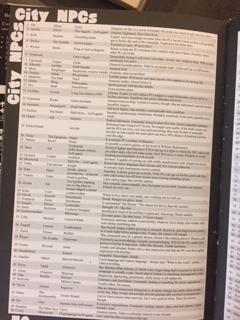
| Simple graphic solution to keep track of NPCs |
 |
| Most fantasy cities are based on a New York model--a grid of knowable streets in a discrete area. I based Vornheim off LA and San Francisco-- and on the way they were described in noir stories--sprawling, borderless, shapeless, linked by common roads, not comprehensible geography. This lead to the realization that unless there's a zombie apocalypse in your game, the geography can be mapped while still being abstracted. |
 |
| I actually invented the adventure as I drew. If you're not an artist or graphic designer, having them on from the jump helps. |
 |
| Name of the room on the room--and descriptive. Not rocket science but mainstream games still haven't figured it out. |
 |
| The famous Vornheim die-drop covers |
 |
| I made this map so that if you invented a location you could write it in and there'd be enough info to place it and describe what was nearby. The drawing style reflects only the info you'd need to nail down a building as specific ("conical roof, grey stone, bridge, near the wall" etc) |
 |
| Split-column tables: roll once and read straight across or, for variety- roll once for each column. I think I invented that. All these projects require telling your graphic designer to ignore rules about things like white space and switching fonts that are bedrock rules of their training. This is a different thing. |
 |
| Red & Pleasant Land was a different challenge than Vornheim. Vornheim was about maximizing the info in 64 black-and-white-pages. RPL also needed to feel like a convincingly luxurious object from inside the gamewold. |
 |
| The gameworld itself was built on gamelike principles because Lewis Carrol's fiction was gamelike to begin with. |
 |
| Nearly all the RPL pictures were done on one big piece of board |
 |
| Name of the room on the room, also invented some symbols that show map structure, like the one in the Liquid Parlor showing a door in the floor and the one in the dry room showing a door in the ceiling. |
 |
| Reprint the relevant section of map on every page. When there's a diagram, make a full illustration out of it to kill 2 birds with one stone. |
 |
| Showing what adventurers in the land could look like: half Alice Pleasance Liddel, half D&D murderhobo. This is a really important part of RPL so it felt like an organic while and didn't just feel like: "Ok, now your knight is sitting on a mushroom" like the April Fool's issue of an old issue of Dragon. |
 |
| Simple map, with random encounter solution (different dice) on the right |
 |
| Monster Manual format, basically. We all use this bc it works. |
 |
| Again showing what adventurers here look like--in this case I wanted Connie to show a black girl fitting easily into the setting's western/middle european vibe |
 |
| Jez Gordon's lovely spread-map. I ran adventures off this one spread for 4 sessions. |
 |
| The challenge in Maze was: I wrote short stuff for Maze, but Patrick's prose was long and I didn't want to edit it much |
 |
| The original painting |
 |
| Left: the color coded version of the map--to make finding the page numbers easy. Right: the original map, which the illustrations make easy to figure out where you are. You go: Oh here's the tongue guy--then quickly find your page. Hopefully offering more context than a standard megadungeon. |
 |
| Every picture in Maze is just a blow up from that one painting. The entries have short summaries ont he first spread.... |
 |
| Then longer ones with any extended prose on the next |
 |
| Search the body table where its easy to find. |
 |
| Colorcoded. |
 |
| Lovely lovely look at me |
 |
| We used the left over space to repeat useful info to minimize page turns: Search the body table, random encounters for that area, minimap, etc. Nobody complained it was redundant bc it helps. |
 |
| for Frostbitten & Mutilated (now at the press) we wanted a real doom/black metal look. Luka Rejec did the graphic design for us. |
 |
| Same info design imperatives as before but different aesthetics |
 |
| Again, almost all the art fit on one page |
 |
| A WILDERNESS MAP WHERE ALL THE AREA DESCRIPTIONS ARE ON THE MAP! So excited. |
 |
| etc |
 |
| etc |
 |
| Info design combines with world design and game design--the Amazon chess game is also a divination game |
 |
| Whole dungeon fits on the spread, as |
 |
| etc |
 |
| Painters take note I just put a bunch of wet thin white paint over a black background and let it dry and it krink;ed up into a landscape |
 |
| Visual random table. Kelvin Green did it first. |
 |
| Demon City. I basically said What's the specific thing I imagine happening in Demon City? That image--the one that makes you think the game is a Thing. Paint that specifically. |
 |
| General description of each Motive (class) at the top of each column, character gen rules underneath, during-game panic rules at the bottom. |
 |
| Shawn Cheng's design can take advantage of the fact that, since its a modern setting, the game can use some modern "designy" looks. |

 |
| I printed out the logo on paper, dipped the paper in water, photographed the water dripping and wrinkling the paper and then tinted it pink. Since modern cities are somewhat defined by the logos and designs all over them, the design IS basically an illustration of the city. |
 |
| The tarot page doesn't need to be consulted fast--it's sexy and that's what's important. |
 |
| Although all the art is by me, I want to give a range of kinds of imagery because Demon City can do the Kubrick Shining horror or Anime guro or whatever |


 |
 |
| I keep telling Shawn to give my art these vintage-looking designy treatments... |
 |
| I eventually just realized: hey why not paint these patterns right into the pictures and give him a break? |
 |
| "Are there any naked men in demon city?" "Not in the art--also no birkenstocks. brown clothes or trees that aren't dead or palm trees. Demon City represents one artist's sensibility: what's there is what I want to look at. You wouldn't say: 'Hey Prince, write some songs about hot dudes'--but it is fair to ask about representation. Right now this book is a limited edition, maybe 1500 copies? But if it becomes a smash hit and becomes an industry-dominating force and many peoples' intro to the hobby then I'd feel an obligation to hire some artists with a less cishet take. I can't pretend to want to look at dudes but I can hire people who do. Fair?" |


15 comments:
This is perfect. I know it's not the class, but it's basically the class. Thanks for this. Oh also I laughed pretty hard at Interpol agents can tell you horror stories of finding the mangled fingers of graphic designers who tried stuff like this at LotFP found littering the Finnish countryside. But of course the truth always makes for great comedy. I also really dig the idea of a visual table! That's awesome and thanks for point it out (and Kelvin Green).
In all fairness I sort of stole the idea from the Lone Wolf gamebooks and there's an Italian rpg that used a similar concept, although I've not seen that.
That about sums it up, I think.
Thank you for the lesson sir.
@Goblns Henchman:
Erased. Harassers are not allowed to comment on the blog.
If you want to comment you need to publicly apologize for lying on the internet and then you can join the grown-ups table
Dag! This has made some wheels turn and I wonder if there is a graphable relationship between words per object/room or words of backstory/gameable information that evolves over time... Which could cross index with publishers... then pegged to pay rates...
I honestly imagine it would look interesting because I pulled out an old Ravenloft module I purchased when I was 7 (its kind of terrible; but it had a Rakasha on the cover & looked so different from everything else in the store) and was blown away by how terse it felt vs current WotC products.
Anyway; that lecture sounds dope as hell & I hope a transcript shows up eventually.
The italian game was Kata Kumbas. You can find the visual tables in the gallery at this link:
http://leganerd.com/2013/01/01/gdr-ufficialmente-morti-kata-kumbas/
In was a great game indeed. Very powerful imagery.
Livingstone, that's the one!
This is a fantastic blog post.
Great post! I missed those map symbols in the Liquid Parlor/Dry Room on my first readthrough of R&PL. Very elegant - I love seeing more ways to make maps more information-dense without overload. Invent symbols? Better use of color? Smarter layout? Oh, all three. Back to the drawing board! Thank you for posting all of this.
F&M ready next week. Looks great. As a part of me is a black metal soul, I really enjoy the Darkthrone, Necrobutcher (the Mayhem musician, Plaguewielder (album) etc. references and the overall aesthetics.
so can we coin the term blurb crawl?
@josh we can and we should
Post a Comment