
STONEHELL If your dungeon isn't more complicated than this, don't make it more complicated than this.

Also worth mentioning with Stonehell are the One Page Dungeons

This one isn't perfect (Where are all the entrances? Also, I kinda get lost in the black lines a bit) but in general the OPDs show the right instincts and learned from Stonehell and its ilk.
CALL OF CTHULU CHARACTER GENERATION

MARVEL SUPER HEROES RPG (FASERIP) UNIVERSAL TABLE

DOCTOR DOOM'S CASTLE

OLD SCHOOL HACK
Let it not be said that all you have to do to impress me is cram a lot of stuff into a tiny space. (Write your own porn joke here.)
There are also good reasons to spread out and take your time, especially when you're laying out the rules of the game. Old School Hack does it in style....

REALMS OF CHAOS: SLAVES TO DARKNESS AND REALMS OF CHAOS: LOST AND THE DAMNED
Unlike most of the examples here, the genius of the design here isn't about efficiency or ease of use--instead the RoC books achieved something many high-end RPG books consistently try and fail to do: look like impressive grimoires of ancient knowledge.
The reason these other games fail is they don't have GW's amazing stable of artists, the artists they do have don't have a sort of within-a-stone's-throw-of-Albrecht Durer style and they usually try to use way too many computer tricks like layering which no incunabula ever had.
And Adrian Smith draws the borders. You can't compete with that.


CARCOSA'S HEX DESCRIPTIONS AND PDF DESIGN
Carcosa has some obvious mistakes (tables that have a few orphan lines spilling onto the next page, information about tables in paragraph form that could easily be incorporated into the tables) but no hex product has ever done better.

WARHAMMER 40K RPGs ORIGIN PATH CHART
You're making me take time out of the game to do group character generation? Make it fun.

THE QELONG MAP
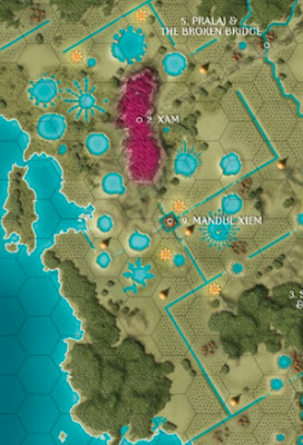
With one glance the GM can not only say what's in the hex and what the nearby landmarks are but actually describe the journey using only the map: "as you leave the dense jungle that lines the coast, the jagged edge of a crater lake is visible across a razor-straight river."
WARHAMMER 40k ORIGINAL ROGUE TRADER VEHICLE DAMAGE DIAGRAMS

There's a blueprint of the vehicle and you dropped the dice directly on it to see where you did damage.
SOME EMBARASSING MOMENTS IN THE HISTORY OF RPG GRAPHIC DESIGN...
AD&D spells- This spell is identical to the Druid spell of the same name on some other page which page? Ha whatevs some page I don't care.
3.5 character classes- How many hit points does a 3.5 ranger get per level? Fuck you we buried it under 8 feet of paragraphs, that's how many. Luckily the SRD exists.
3.5 monster statblocks- Asking a 3.5 statblock how much damage a troll does is like when you ask your grandmother where she got her hat and then she starts off explaining how your Aunt Chloris was in Poland and owned a bean farm and most of the children in the neighborhood had gout and so she went to talk to a goat and...
4e character generation- PCs that can fit on one piece of paper spread out over 4 pieces of paper (probably more elegantly than I did it), character generation pages that don't actually show you how to generate a character. A fine example of how making a game look expensive isn't the same as actually doing the goddamn graphic design.
All official D&D character generation ever- Flowchart, guys. How hard is that? Make a goddamn flowchart with little pictures of dwarves and dice.
Keep on the Borderlands- It's how many pages long? And 80% of it fits on 4 pages.
Most Story-Game-style RPGs except 3:16 Carnage: Pictures? What for, we already have white space? Can't we just use stock art? Let's just use stock art. If you ever wondered where Mark Rein-Hagen would be without Tim Bradstreet or where Neil Gaiman would be without Dave Mckean and Mike Dringenberg, check out whatever's hot on Story Games this week.
WOTC dungeons- Yes, here's another dungeon where the mind flayer isn't smart enough to leave the library no matter how much noise you make killing the giant crashing chandelier golem in the parlor because we can't figure out how to fit more than one room on a page.
Night's Black Agents character gen- You don't actually have to read a whole chapter to make an NBA PC.
D20 Versions of old Judges' Guild stuff- Your players will never find the lost empire of the dragon turtle kings because you will never find it. Because the book is too busy telling you the population of the village near it is 17% cave-hobbit and their main agricultural product is buckwheat. And telling you in paragraph form.
SOME PROBLEMS THAT NEED TO GET SOLVED
Character sheet as character generation guide: This can't be that hard. One page, everything you need, all the relevant results. Maybe two pages. Still: worksheet. Figure it out.
Weapons: Every single weapon in a game has concrete advantages and disadvantages (that's why they were invented). A new player should be able to look at a one-page array of items and instantly see both the available variety and what each thing's plusses and minuses are without being a gunporn fanatic. Prices don't have to be big, ok?
Visual index of monsters: By habitat, by level, and/or by type. Lots of little pictures, grouped together in one picture in ways that would be useful to a GM mid-game at a glance.
Visual Index of anything else GMs need to pull out of their ass at a moment's notice: Countries, plot hooks, villains, stock NPCs, etc. A big picture of, say, all the possible class/race combinations in a given setting would be useful to have, or of common trap types or spells.
-
-
-


68 comments:
Long time listener, first time caller - big fan too.
You say graphic design, but i'm not sure thats exactly the right phrase - some of those examples above feature HORRIFIC typesetting, that would get even a junior designer a stern talking to by their creative director. Functional, sure. Good? maybe not so much.
Some of your examples of bad design rail against process rather than presentation, which are two things that should be kept separate and distinct. Good design can mitigate bad process, but not entirely - thats why we have UX designer's who's sole purpose is to look at the process and then turn that over to a seasoned digital/print designer to lay it all out ready for the printers/distribution.
I agree that you've selected some excellent examples of process in the top half, but that doesn't necessarily equate to good graphic design.
You are completely wrong.
Just because the design doesn't follow the received orthodoxy of your business does not mean it's "bad". It's only "bad" if it doesn't work.
And it does.
Graphic designers can be worse than wine snobs, I swear.
I heard the same shit about Vornheim from graphic designers when it came out.
Until it started winning awards and sold more copies than any OSR product ever.
Character sheet as character generation guide
How about Searchers of the Unknown - Character Sheet version?
http://www.scribd.com/doc/60238307/Searchers-of-the-unknown
I agree with Zac on this. Found this a while ago, perfect example of what good design should do...
http://cartographia.wordpress.com/2008/04/30/napoleons-invasion-of-russia/
Defensive much?
Read this article of Dieter Rams, although im sure you;ve probably already heard of him :) the chap probably forgot more about design than you or i will ever know. And his theories that took decades to perfect do seem to support what i'm saying.
As for Vonrheim, selling a bucket load or wining awards doesn't make something inherently good, it proves people are willing to overlook shortcomings if it has some great aspects. Or perhaps even that people will jump on a bandwagon if they're entrenched in a fandom, just look at some major recording artist in the charts, by your definition are they great? I somehow don't think you'd agree.
I cant comment more specifically on a product i don't own, but if you receive a whole bunch of feedback, could you conceive the possibility that there might be, somewhere deep inside it, a grain of truth?
The piece on napoleons invasion of russia is great, excellent type clear, well set - form AND function.
I swear OSR Hipsters just love to argue for the sake of it.
http://en.wikipedia.org/wiki/Dieter_Rams
This is a subject near and dear to my heart. I'm not trained in design, but I'm trained to be aware of audience. And it has always been weird to me that the industry doesn't think more about their products as things used by gamers at a table. They seem completely oblivious of that audience, making books more for aspirational gamers or something (like folks reading campaign settings for the day they might be able to play).
A Visual Index is an idea I hadn't thought of and is really cool. I had thought of putting visual indicators on pages and sections of pages, but now I can see a back page with a bunch of illustrations and page numbers by them. I think that would work well for books past a certain page number.
So basically function first.
That is a cut e stapler first needs to be a good stapler ( unless as the RoC section implies it's a really, really cute stapler.)
I often suspected that AD&D was laid out by someone who was told "Make sure they wear these books out," as you needed to constantly flip about trying to remember which paragraph the information was in. They often designed text books, rather than reference books. As when,you had to look on four pages to figure out what your character class was, rather than one chart.
Zak SAugust 16, 2013 at 10:08 AM
Since this is your first time writing in, you may not know that:
ad hominem attacks
appeals to authority
and
starting an argument and then proclaiming that someone is needlessly arguing
...will get you nowhere.
I am saying the received wisdom in your field is incorrect in the case of RPG design.
Either:
1. Accept that
or
2. Make a solid case (with examples) that I am wrong)
That's good
Yeah, Zeb Cook pointed out that RPG-book-as-teaching-tool and RPG-book-as-reference-manual are 2 different kinds of book and RPG books needed to be able to function as both
Perhaps relevant (from Google+)
Ramanan S5:52 AM
+Zak Smith I can't comment on blogger blogs, but I would point out that Stonehell is hella ugly. Someone with some artistic sense could take that whole product and probably make it look nicer, while keeping all the elements that make it work as a great RPG tool. I think that's the point that first guy commenting on your blog was trying to make.
Zak Smith10:42 AM
+Ramanan S I think neither you nor Eglinton is being careful to separate "my professional expertise" (i.e. "I know what kerning is") from taste (i.e. "I know what's ugly"--no, you don't, at least not for anyone but a chosen target audience).
Now Stonehell is (I will agree) totally suboptimized in terms of appearance.
HOWEVER: considering how much total shit every other dungeon is in terms of functionality, that's like saying that you don't like the way the deck chairs are arranged on the only ship that manages to float .
I could see you making the font and spacing work better on most eyes, but Stonehell's insight into what's important at the table is far more important than that.
cole long10:46 AM
i.e. stonehell's negative aspects in presentation are trivially changed without having to touch the hard-won impact of the positive aspects?
Zak Smith10:49 AM
+cole long Yeah.
And the negative bits don't really impact the user experience and the fact that any design 102 student could redo the fonts and spacing on it to make it better does not obviate the fact that _every_ design 102 student missed out on the insight the Stonehell guy had. For 30 years.
An ounce of insight and functional innovation is worth a mountain of tidying up.
Zak, this is only tangentially related, but I'd love to get your thoughts on it.
In an RPG core book introducing both a new world and a new rule system, what would be your ideal order of topics? What should go first? Basic rules, setting history, racial write ups, class write ups?
I asked because I've played and written a ton of different world books, and everybody's got something different. The White Wolf books have 120+ pages of flavor text before introducing the game rules and character building. Rifts has a 500 word overview of the setting, than rules and char-gen and THEN world history. WoTC's worldbooks always have the same basic format of: races, classes, feats, gear, world info, monsters.
There's strengths and weaknesses to each approach. I'm curious what you prefer, and why.
(As an aside, my favorite layout is the one used in Cyberpunk 2020: Cybergeneration. You've got a character creation mini-game that serves as a basic introductory adventure that lets you build a character at the same time you get acquainted with the game world.)
http://dndwithpornstars.blogspot.com/2011/03/how-i-want-to-hear-about-your-setting.html
I think the market leaders have idendtified that a large portion of their audience will buy the book to read and not run. To live vicariously through the module as they in all likelihood wont get the chance to run it. Paizo openly admits that their adventure paths need to be fun reads, hence the padding, page long back stories players will never find out. All this readablility comes at the cost of functionality. Give me Stonehell any day over a Rise of the Runelords.
The market leaders present module as novel, a pretty novel but it stifles play. I think they are sending out the wrong message to module publishers in general. Which has led to the state were most modules as written are padded affairs that I really cant do much with.
Am I on to something with the rise of the readable module?
Ugh yes I think you are onto something but calling them "readable" might be a stretch. Some of the old Call of Cthulhu modules make pretty good 2nd-person novels (Horror on the Orient Express especially), and they're kind of spooky, but film and novel genre horror is scarier and more interesting. And WOTC adventure paths and modules are bottom of the barrel in terms of quality of writing. See: Zak's reviews of "Return to Castle Greyhawk!" or whatever it was called. Even LOTFP modules which are pretty well written have been a million more fun to play than read.
Moral of the story - play games, read books?
That wikipedia article lists a few core tenets that Dieter Rams pioneered, such as "is innovative! makes a product understandable! is honest! is thorough down to the last detail!'
@David Eglinton - maybe the fonts are ugly, but it looks like the above examples do follow those tenets. I've read Vornheim and used it do death, because it also follows those tenets. Zak built a tool from the ground up based on what he needed them to do, and presented them in an accessible and easy to understand way. Isn't that good design?
"I am saying the received wisdom in your field is incorrect in the case of RPG design."
Interesting, one would have thought that a 'wisdom' from a field the creates page layouts (amongst other things) would apply to a product that has - page layouts. It would be great to know how you came to this conclusion?
"1. Accept that"
When you can present a logical argument to support the idea that RPG's books and docuents are exempt from traditional and universal design laws, with examples to back it up, possibly.
"2. Make a solid case (with examples) that I am wrong)"
I thought i did that? My original post was logical and coherent, explained what i thought and why, and my follow up provided links to an industry recognised expert and summary of his widely recognised and accepted theories that support my argument - but that doesn't count as a solid argument with examples? If so it would be great to know what you consider one.
Furthermore, what the hell is up with you? my first post wasnt scathing, rude or obnoxious (and if you felt it was you've lived a sheltered life considering the volume and severity of vitriol on the internet, some of which i've no doubt has been sent your way in the past as a popular blogger)
Someone was posting about a two subjects i know something about (design and rpg's) yet i felt their post had some failings so i chimed in, if you cant take criticism or if you don't want to discuss the articles you write don't open them for public comment.
If your going to call people snobs and insinuate that their opinion doesn't mater when they present an alternative or contradictory opinion, essentially thats a couple of steps away from you, sticking your fingers in your ears and going 'la la la' quite loud.
As you can see from some of the other comments from g+ it does appear there is some validity (or at least other people lean towards agreement with me) in what i was saying, so perhaps this 'received wisdom' or whatever im calling on does have some relevance when it comes to producing functional and aesthetic books.
And so, to restate my point, perhaps so it can be better understood. The examples you posted are good examples of function - they are not however the best examples of form. Look at the amended 4e statblock (mm3 onward I believe) This is an excellent example of both form and function. Your original article rails against good and bad graphic design* yet really i think you mean user experience, the experience of flipping through a book and it being functional and pleasant to use.
Hopefully thats easier to understand.
*Oh and how is your 'received wisdom' any better than mine, or can i just dismiss it out of hand like you?
Toodles -
@Nate L. Its hard to say as i don't own the product but have been able to skim through it, it definitely has its own aesthetic and theres nothing wrong with it (I wouldn't dismiss something looking crude for badly designed, look at David Carson as a good example)
So i cant really comment on whether form meets function in this case, I can however touch on zak's comment that he had ".. heard the same shit about Vornheim from graphic designers when it came out." So if a body of 'professionals' (as that what i'm assuming they are) passing criticism on a something it would lead you to believe that there is a grain of truth there, smoke without fire and all that.
That's called an argument from authority and it's a logical fallacy.
And, of course my wisdom here is not "received" i.e. it is not based on people telling me it works.
It is based on actually observing it working.
At no point did i say "The entire graphic design community thinks." You've read into my personal comments and seen that argument from authority. It would appear its you're own anti authority hang ups that have lead you to read waaaay to deeply into 'heres what I think' post.
It might be worth at this stage noting that i'm not actually a graphics designer, and at no stage have a I ever said i was. You made the assumption i was, again evidence of you reading into my post and gleaming details that weren't necessarily there. Im a motion designer, i do animation and 3d modelling. It just so happens that those activities occur inside design studios where 50% of the employees are Graphic Designers. So after 8 years, i've picked up a bit of knowledge.
Plus, still no actually support of your side other than a flat 'i'm right your wrong statement' because i say so.
You're observation of something working doesn't sit into the generally accepted view of what is considered to be 'working well' sure it works, I haven't suggested it doesn't. After all i can read the pages, but i suggested that they weren't the best examples of them working 'as good as they could' which by and large is a halmark of good design.
My original post was more "your saying Graphics design, but you should be saying user experience" (but i think i've mentioned this before - i guess your just passing over this point, but, whatev's)
And also, no response re the overeactionary tone, all very polite now so thats a bonus. Ta'
I did always like the Cybergeneration character, er, generation. The equipment section, presented as a series of double page spreads of shop fronts, was quite clever.
"It would appear its you're own anti authority hang ups that have lead you to read waaaay to deeply into 'heres what I think' post. "
This fallacy is called an Ad Hominem argument.
"Plus, still no actually support of your side other than a flat 'i'm right your wrong statement' because i say so."
I will lay it out for you:
-The GM accessing game information at the table during play quickly is an absolute good.
(Disagree?)
-Flipping pages and hunting for through room descriptions takes time.
(Disagree?)
-The Stonehell layout allows a GM to find information about the dungeon very quickly
(Disagree?)
-This is based on having run it and similarly laid out dungeons many times. (Do you doubt this evidence?)
as well as
-...being based on playing under GMs who have run it and similarly laid out dungeons many times vs. ones laid out more traditionally. (Do you doubt this evidence?)
-With a dungeon, (especially a very traditional one like Stonehell) functionality to the one and only person at the table looking at it (the GM) is more important than crossing the i's and dotting the t's about making it look as pretty as possible.
(Disagree?)
-Even if it -weren't- , the fact is the i's and t's can and _have_ been crossed for 30 years without anyone making the vital presentational innovation Stonehell and its ilk made: getting all the information together.
(Disagree?)
There it is: laid out for you with no appeals to authority or any other fallacies.
If you have a problem with any of that reasoning, _type what that is_ .
Now:
"After all i can read the pages, but i suggested that they weren't the best examples of them working 'as good as they could' which by and large is a halmark of good design."
If you're simply saying they weren't the best example _theoretically possible_ I'd be with you.
However,2 things:
1. Most dungeon design is so shitty _there are, so far as I know, no dungeons which make the (important) functional changes Stonehell did while also making the (less important) superficial changes you're referring to.
That is: it's the best example _we have so far_ in terms of what matters most which is functionality.
And,
2. While there may be, buried in all the 1-page dungeons, one that actually is as functional as Stonehell while also meeting all the requirements of graphic design 102, Stonehell deserves special praise for its _innovation_ in presentation.
"no response re the overeactionary tone"
Again: your scolding tone in the first post "but that doesn't necessarily equate to good graphic design." (of course it does, that's why I posted it) followed up by:
ad hominem attacks
appeals to authority
and
starting an argument and then proclaiming that someone is needlessly arguing
plus, now adding on
refusing to present a rational argument
and
lying about my argument
...pretty much put you no place to scold anyone about etiquette here.
If you have a problem with something someone says...
ASK A QUESTION FIRST.
Make sure you got your facts straight before launching into trollery.
Hmm not sure if worth it but here goes..
My main points are, and have always been as follows.
A) That the article above comments on 'graphics design' when in fact it is actually commenting on user experience.
You have explained very eloquently that the particular stonehall example, is a good example of user experience. I agree. It is not however in my opinion a good example of graphics design. (a home grown opinion, informed by but not a representative of, industry experience)
B) You're attitude is snotty, conceited and features a general rude tone from the get go.
I suppose if you consider the phrase "but that doesn't necessarily equate to good graphic design." - scolding i'd reason one of a few things, - you're arguing for the sake of it OR a hyper sensitive individual/have a very delicate ego and is someone who cant deal with opposing or differing opinions.
If i caused offense by my scolding tone, then i offer you my sincerest and heartfelt apologies, it was never my intention to upset you.
I shan't go tit for tat on 'he said, she said' but let me just remind you of your opening shot "Graphic designers can be worse than wine snobs, I swear." So maybe that might go some way to explain any perceived crappy tone from my end.
A) The design is where the user experience comes from
Also: if you have an opinion, don't pretend it's fact.
I laid out facts to support an OP presented as advice. You laid out an opinion and used the language of objectivity ("good") and backed it up with nothing except claims referring to professional expertise. Don't do that.
B) Again, your ad hominem attacks must go.
Do that again and you'll be modded as spam from now on.
C) "Upset" and "offense" are not the important ideas for me here. I am neither upset nor offended.
What's I am is _evaluating whether you are smart enough to allow into the conversation_ .
Making repeated ad hominem attacks isn't smart and contributes nothing to the conversation.
D) As for wine snobs: again, you boldly, in your first comment presented opinion as fact and gave _no_ evidence. This is the mark of the snob.
If you stop doing that, you might be accepted back into the ranks of "smart enough to be allowed to be part of the conversation"
Aha didn't realise i wasn't smart enough to comment here, wont happen again - thanks for pointing it out ;)
As I said, the purpose of this conversation is to determine that.
If you will submit no further evidence, then we'll have to assume you actually are stupid.
Sure, if that will draw a line under it for you, we can do that.
Again, the important point is:
If you mean the things you said, you are literally too stupid to productively contribute to helping anybody play RPGs on line.
If you didn't and have some excuse like, say, a girl scout came to your door selling cookies and then one of them popped out of her chest and turned into a 3-eyed lunatic and started whaling wild invective onto your keyboard while you weren't looking and then pressed "enter" then maybe I'll reconsider.
Didn't we conclude this a couple of post ago? No?
Sure sure, we get it, i'm stupid. Its a realistic assumption i suppose. I mean looking back over the comments its clear to anyone that i literally have barely the intelligence to string a couple of coherent sentences together let alone have even a partially valid point. One wonders how my nervous system copes with the multi tasking of actions such as breathing, talking and other hum drum activities.
Oh and isn't calling me stupid an ad hominem attack? But im sure you'll have a reason why its ok, probably because im too stupid hey? hah funny stupid people. with their ideas. stupid.
Anyway, as a closing note, i am sorry Zak. you are right, about everything. Literally everything. I couldn't conceive of a universe where you wouldn't be right. about everything. And i am truly deeply, deeply sorry that i posted a contrary opinion, especially in a format that didn't clearly abide by the universal rules of having an opinion and voicing it in an open forum.
im out. x
An ad hominem attack is when you claim an _argument_ is invalid because the person making the argument is bad.
My thesis is:
You are stupid
My evidence is:
You made ad hominem attacks
appeals to authority
started an argument and then proclaiming that someone is needlessly arguing
refused to present a rational argument
and
lied about my argument
..so, no, that is not an ad hominem attack.
My other thesis:
You are wrong about graphic design in RPGs
was refuted above using different evidence.
Also, more evidence that you're stupid would include:
Confusing an ad hominem attack on a position ("The design of this RPG thing is good/bad") with a separate actual argument (supported with evidence) that someone is stupid
and
presenting opinion as fact with no evidence
and
confusing a rational dismissal of you as useless to the project of gaining knowledge about RPGs because you're very dumb with an irrational dismissal of you simply for disagreeing with me.
@David Eglinton "It is not however in my opinion a good example of graphics design."
If its graphic design and it works well then how the hell can it NOT be a good example of graphics design?
I see this attitude in designers from time to time and it always baffles me. I know some graphic design isn't meant to be utilitarian, but when it *is* supposed to be then it's a good thing if it achieves that, surely? Or are you just objecting to graphic design being "merely" about the user experience? Is this just Art Snobbery in disguise?
@Nagora The point i was making was that User experience and Graphic design are two separate disciplines, these are good examples of UX but not necceserily GD. Thankfully we have established that i'm stupid, and my point is invalid. Something i'm going to have to learn to live with i guess.
If you want to make an argument that the excellent User Experience isn't due to the Graphic Design..
_make that fucking argument_ ....
...don't just dodge in, make a flip remark and dodge out.
I mean, graphic designers reading this (Ram, Jez) seem to think what's good about Stonehell seems to fall under "Graphic Design", what's your exact point here?
Whatever was done to Stonehell's layout to make it work well at the table, whether you want to call it "layout" "graphic design" "information design" or "user experience" the person at a game company in charge of making that kind of thing happen would be the _graphic designer._
"User experience and Graphic design are two separate disciplines,"
"Separate" seems much too strong to me. I would say that user experience has to include graphic design (in visual mediums, obviously). Can you think of an example of a good visual user experience which has bad graphic design that we could look at and see where the line might be that you're drawing here?
You characterised some of Zak's examples as having "HORRIFIC" typesetting, yet the whole point of typography is the transmission of information. If it's doing that well then it simply can not be horrifically bad IMO. Which ones were you thinking of specifically?
I thought i did in my first snarky post "Good design can mitigate bad process, but not entirely - thats why we have UX designer's who's sole purpose is to look at the process and then turn that over to a seasoned digital/print designer to lay it all out ready for the printers/distribution." You can also reverse that statement to read - good process can mitigate bad design, but not entirely. I didn't reverse it originally because your smart.
I digress, we've already established my argument is invalid, poorly constructed/presented and generally stupid, not sure why your still flogging this horse? I was summarising my point to Nate, and before you respond to this, i don't need another post telling me i'm stupid/wrong/whatever. I think we've covered that quite sufficiently.
Thanks. :)
Anyone who answers questions when asked might conceivably provide insight and return from snarky trolldom to be a useful person.
But: David, again _that isn't an argument_ .
That's a bunch of vagaries. The words "stonehell" and "typeface" don't appear in it and there are no references to how it's use at the table and which parts of what I describe and display in the blog entry you're trying to comment relevantly on are and are not graphic design.
Can
You
Do
That?
Can you actually point to the thing (Stonehell? We wouldn't even know that's what you're probably talking about if Ram hadn't pointed it out for you) and actually describe what things you think are and are not graphic design?
And also describe the effects of the "horrific" typesetting.
Like: will this impact anyone ever at the table or is this just tastewankery?
Zak, are you assuming that in my first post, because i said that there are typographical errors and poor elements, that it invalidated the pages usefulness at the table?
Is tastewankery something that should be avoided? Do you think that aesthetic/art direction is an important part of rpg's for some players, and thats ok?
RE: poor typsetting i could go through several of the examples and ring rivers, orphans and poor kearning etc. But that would be a disproportionate effort vs satisfaction return. forgive me. Can we make an assumption that elements poor typsetting exist or do you actually need specific examples?
Wow, you're answering questions. Big improvement.
Ok so:
1. If a page is more useful (in all dimensions) than another way of doing a page, is it better designed?
(I say: yes.)
2. If the answer to (1) is yes, then Stonehell, no matter how fucked the typography is, is still "better designed" as a whole than nearly every dungeon ever, eventhe ones with fantastic typography. Agree or disagree?
3. If not (2) why not?
4. The importance of tastewankery--where we go "Oh this looks prettier" depends a lot on _what_ the prettier in question is. An illustration that looks better could change the way a person plays the game (Oh, I wanna play that class now! Oh, I get how that is supposed to feel now!). In the layout of a dungeon for use by the GM? What is the supposed gain there? The GM looks down for 3 seconds, gets information, looks up again.
Considering how much fun a GM can get from just doing this with totally un typeset scribbled notes, what and how big is the supposed gain of making this look better even if we pretend that we can all agree on what looks better?
"Wow, you're answering questions. Big improvement." - thanks, you make me want to be better than i am x
1. what is design? just the function, just the form or a mixture of both? (i'd say both, and as such each element can be critiqued independently of each other)
2. Only partial agreement here. Stonehell has great function yet hurts my eyes. (abstraction, it doesn't actually hurt my eyes)
3. See 1.
4. Are assuming that the ONLY function a page layout has, is to transfer data? Can a page not exist as an object that one derives pleasure from just being read? Do you read because you enjoy looking at rpg books, or is it solely to increase your knowledge and as such derive no pleasure from the process of looking at a well design page?
!. You didn't answer the question. It was a yes or no question. In order for your argument to be coherent you need to answer it.
2. If it doesn't _actually_ (i.e. literally) hurt your eyes then in who cares if you do or don't respond aesthetically to the typography.
3. See 1.
4. Your answer here seems to completely ignore what I typed (i.e. about different page having different functions) please try to answer it again less vaguely.
1. I didn't realise the question was binary, you should have stipulated that.
2. I care, and i must assume that other people care. (i draw the assumption from the fact that there is no such thing completely unique individual, my likes and dislikes will be shared by others. probability tells us so - and even if that group is a minority, do they still not deserve to be catered to?)
3. see 1.
4.My answer doesn't ignore your question, It answers it by asking further questions to get to the root of the issue so it can be explored. Are you looking for binary yes/no answers? if so why?
5. You failed to answer any of the questions I raised in response. please answer them if you wish to continue the conversation.
1. It is. answer it.
I need an answer because I don't even know how to frame useful conversation without clarifying that simple point. If the answer is "yes" then one set of clarifications is needed, if the answer is "no" then another is needed.
It is part of the nature of all request for clarification that _neither side is sure_ what the other side does not understand about their position: thus the need for clarification.
2. I didn't ask if you care, I asked _why_ anyone (including you) should care . Like I don't like the font on the bottom of my shoe, but that doesn't constitute an argument that that particular thing is an important part of evaluating the shoe.
Please explain why a taste clash in typeface affects your experience significantly.
3. See 1
4. See 1 for why I'm asking for answers. I asked a bunch of questions. Please
actually
answer
them
it will help this be a conversation.
_
I'll try to answer all your questions. If I don't answer any, say that.
"what is design?"
The difference between what everyone on a project other than the designer turns over to the designer and what the designer turns over to the printer.
In the case of graphic design it is usually the visual presentation of a given set of pre-determined information.
"just the function, just the form or a mixture of both?"
Design is just a form. Function is what happens when the design is turned over to a person. If this is reliably the same it can be considered to be due to the design.
A less vague question would be: What's the point of design, to inculcate a function or to look good?
Well both but different projects require different priorities.The answer depends largely on how the thing is used.
I am arguing that in a one-user-uses-maybe-once-maybe-twice thing like a dungeon you need function waaaay over looks good if there's a clash between these 2 priorities.
I am also saying that this design problem has been solved so poorly in almost all previous examples that if this isn't "good" then no dungeon design is.
Further, because so few designers are familiar with GMing or playing or take the work seriously, people have been paying soooo much attention to the easy standardizable shit (kerning) that they lose the forest for the trees (functionality) and have been losing it for 30 years and so a thing that finds the damn forest is "good".
" even if that group is a minority, do they still not deserve to be catered to?"
Maybe. But the question is whether your first statement that this is "not good design" delineates a line that would make it more useful or desirable to you or not. Like whether it would actually move the needle in you buying/committing to it.
And then, further, whether (assuming you did buy it) whether it would have any effect on the game experience.
"i'd say both, and as such each element can be critiqued independently of each other"
Surely if the answer is "both" then each must be critiqued in reference to the effect improving that aspect has on the other, and the trade off/compromises that are inevitable? It seems unreasonable to say that a family car can't do 160mph without mentioning that changing the design to allow it would obliterate the usefulness as a family car, for example.
"Can a page not exist as an object that one derives pleasure from just being read?"
Certainly. Harmonic proportions and use of margins, fonts, and line length etc. can make a beautiful page out of a text in a language you know nothing of. But I would counter that it is impossible to make an ugly page which is also good for reading. If a page is good for reading, then how badly designed can it really be? Accepting that anything can be improved, of course.
Zak, you've written a long post and its late, i'll skim it and then have a good read tomorrow and respond, as not to rush and say something that would make me appear stupid. heaven forbid.
You came _here_ buddy.
You wanna talk, make sense so the rest of the world isn't wasting their time.
You don't wanna talk? Nobody's forcing you.
No need to be snippy.
Actually, now I look closely, I can't see a single example of an orphan in the examples, David.
That was a polite - "lets pick this up tomorrow" didn't think it was polite? I've covered this before, i feel you are being overly delicate and reading too much into my tone. Thats by the by, and doesn't really affect our conversion my end.
1. No. Not necessarily. (but often yes, it can be subjective - the subjective part is the reason i expanded on this point rather than giving a binary answer, do you not understand that this could be a 'grey area' in need of exploration in this conversation? It would be helpful if you are looking for reasonable and thorough discourse that we could expand and get clarification as we both need to, not just one side)
2. You did ask who cares. "who cares if you do or don't respond aesthetically to the typography." Poorly framed question then?
But i get where you're going with your response, so i wont be pedantic and reply, Your example of a shoe is invalid, the font doesn't have a direct relationship to its function, however a font on a page layout does. We read the page therefore visible elements impact that process/experience.
Why does the typesetting (amongst other elements of graphic design) impact my experience? Because i enjoy well laid out, good looking pages. Is this significant? you could argue against i suppose (id suggest its personal preference and has an element of inferred significance to the owner of the opinion)
3. You happy with my response to 1?
4. ^
--
"Design is just a form." Incorrect, i would say that it can also be theory and ideas. Would you say art is just form?
"Function is what happens when the design is turned over to a person." In a sense, thats why we have UX designers to pre-empt that journey of interaction.
"Well both but different projects require different priorities.The answer depends largely on how the thing is used." Almost correct and this is important. but ill get back to it*
"Like whether it would actually move the needle in you buying/committing to it." If a product is visually un-appealing, there is a chance if i haven't absorbed the true nature of its superbly designed user experience that it could get passed over. Probability dictates this is true for others also.
Now back to the *.
You say that design has different priorities and i agree, and thats the crux of this argument. You place more value on the functionality (or the over performance of the function in relation to the others) in this case, i however suggest that all of the considerations should be weighed as equal. If one is deemed less important, then all are as unimportant (in the eyes of the designer)
Again, let me state. It does not diminish its usefulness. An ugly shoe still keeps your feet dry. You just look like shit whist walking through puddles, and if your buying a fashion item then its a poor example of a fashion item.
"If a page is good for reading, then how badly designed can it really be?" As badly as it is designed.
""Design is just a form." Incorrect, i would say that it can also be theory and ideas.
That seems like a literally insane statement to me, like saying grass is also "theory and ideas". Like: design is a verb. You do it. You can have theory and ideas ABOUT it but that isn't what it is.
"Would you say art is just form?"
Yeah.
BUT THAT;S A TANGENT....
Let's get back to this.
I submit that 30 years of RPG publishers getting design that weighed "looks nice" equally to "actually fucking functional at the table" has resulted in a ton of bad things"
-modules not getting used
-modules getting used and it not being fun 'cause it's so slow
-GMs giving up in frustration
etc etc
Like I'd say, in terms of effect on the world, if you weigh "typeface looks nice" (etc) equal to "useful at the table" you are:
#1 Just going against my personal priorities
#2 Going against what is, in the end, good for most gamers
and
#3 Accepting an orthodoxy that has lead to a lot of bad or suboptimal things in gaming happening
Aesthetics that have no functional end are great, but not at the cost of functionality
ESPECIALLY in a product only the GM reads and
ESPECIALLY in a scenario, which is used rarely, and referenced at the table during play
Stonehell. It's a well known fact that long line lengths are difficult to read (theres a reason for multi-column broadsheets and the size of novels - the eye is better at many short hops than long ones). With that in mind, the Stonehell Room Key should be split into 2 columns. Also Table A heading and subead should be better visually differentiated, and no nead to repeat "Crypt" 3 times - signal to noise ratio is off. Otherwise pretty good. Always liked the Marvel Super Hero chart.
To me Realm of Chaos Slaves to Darkenss has a completely different feel to Lost and Damned. 2 words: Ian Miller.
@zhu
Again, Stonehell is _correctible_ but it's still better than everything else on account of how every other dungeon designer was busy tryna get the right number of columns and adjust line length
Part A)
If it seems like an insane statement, then it can't be anymore absurd that the original "Design is just a form" statement. It was after all a response.
Design obviously isn't just a form, it is in fact a process. This is self evident to anyone who has ever designed anything.
The process is thus:
A.Theory - B.Production - C.Consumption
Theory , this is the part with the ideas, you think about the other two steps (B.production and C.consumption) you ask questions such as: How will i create this? Who will use it? What will it look like? What journey will the user be taken on - if any?
Production - The graft, this is where you enact and bring to life all the questions you have answered in the first step. You may finesse those questions as complications arise, however the goal generally remains the same, if it doesn't you need to go back to the brief.
Consumption - The artefact is handed over to its target audience, you may also receive feedback (just like vornheim?) Its your prerogative whether you act on this feedback next time round. (just like vornheim, which i believe the feedback was largely positive, i.e keep it up)
Why am i explaining this? It appears you do know what design is, but have misinterpreted the whole process. Or be wilfully ignorant in order to prove a point? But i doubt that, you're too smart.
So we have established that design is a process, one that can be broken down and evaluated. And furthermore that one of the steps is determining a users experience. We should be able to critique this step separately without detracting from the merits of the other two steps (b.production and c.consumption)
Part B)
So..
I submit that the examples you presented are good, quite possibly excellent examples of the first stage in design (a.theory) The proper label here is user experience design. Or UX. Quite literally designing the experience you want a user to have
I also suggest that the second stage (b.production) is lacking, it has a poor aesthetic and would appear not to have been considered in a fashion that befits such a good first stage of design (a.theory) The proper label for this stage would be the graphic design. quite literally designing the graphics.
So you can see that I am correct thusly: by breaking down the definition of the word design, we find different area's of expertise. User experience. Graphic. Product. Games. Level. Interface. etc etc. They are all areas that fit into a catchall process 'Design"
We know this to be relevant to the argument, as you don't get a job as just 'A Designer' you can get a job as a designer - of something. Therefore its evident that the something, ie the breakdown of the process is important. Otherwise you wouldn't need skilled people to handle separate tasks. And if it is important, as we have established just now, it is then worthy of being examined in isolation AND in process.
I think that this more than outlines what i think and why im right.
At this point i think its fair to say that the dialogue is over, i sincerely doubt either of us are going to add anything more of merit to it. We are arguing (or conversing whichever label suits you) about too little, too much.
There a few things i've learned. About myself and you.
1) i'm an art snob - probably fair assessment, i'd call it being visually driven, but thats probably snobby too right? (rhetorical question, i don't need an answer)
2) I'm not actually stupid - i just don't present my argument/opinions in a fashion that suits you. You have pre conceived rules about how ideas should be presented that other don't and shouldn't have to share, we did not all do debating at high school. (ie cut us some slack)
3) You use your intelligence as a front allowing you to harangue and badger people with opposing opinions into conceding. I know this to be true from the several posts where you have directly insulted me, through the thinly veiled argument of, 'your arguments are badly presented/you don't understand how to argue and therefore you are stupid.' (the same could be levelled against me no doubt, albeit im not trying to use my intelligence as a front)
4) You have a big ego, and don't want to lose face or appear wrong. This evidence has been presented in point 3, i would suggest that a lot of the intense, aggressive debate coming from your side is down to the fact that your ego wont allow you to be 'bested' or seen as being incorrect.
To further illustrate this point im sure you will want to get the lastword, or carefully de-construct my post showing how it was me all along that was being an arse. This would be your ego, if you dont have one - let it go.
5 ) We both love to argue, the evidence is the lengthy posts above.
Now as i've already stated why im right about my points raised in this, and the post's above - you have have stated your side, and it fair to say that we have reached a point where going any further is futile, i'll leave it with you. Just bear in mind that there is no need for a response to this, we both know each others opinions on the matter, I wont be reading any replies as i consider the matter closed. Any further responses would be an appeal to your own ego or an attempt to incite further pointless debate.
It has been fun, thanks.
Kindest regards.
"Design obviously isn't just a form, it is in fact a process. "
Dude, I said that already. Design's a verb.
But you seem to be confusing two ideas.
"what does the word "design" mean" which is an easy question which I answered
and
"what are things involved in the job of a designer"
which is what you're on about now
Like: Feedback is not design.
If I go "that fucking letterspaced gil sans is fucked up" I'm not designing.
If my designer acts on that, that's design.
But NONE of this wordmangling explains what you think of what I just laid out:
"
Like I'd say, in terms of effect on the world, if you weigh "typeface looks nice" (etc) equal to "useful at the table" you are:
#1 Just going against my personal priorities
#2 Going against what is, in the end, good for most gamers
and
#3 Accepting an orthodoxy that has lead to a lot of bad or suboptimal things in gaming happening
Aesthetics that have no functional end are great, but not at the cost of functionality
ESPECIALLY in a product only the GM reads and
ESPECIALLY in a scenario, which is used rarely, and referenced at the table during play
"
Question:
Do you really think that in the face of that, when designing a dungeon, function and aesthetic details that don't affect function are equal?
Yes or no?
And if so, why? What does anyone, including you, get out of that?
"poor aesthetic "
You again confused your personal preference with an objective fact.
Do you realize you're doing that?
Also, if I was trying to badger people into conceding I wouldn't be asking these questions because I wouldn't be _curious_.
Like: you're repeatedly saying crazy shit. I am curious to know why.
If you _concede_ I never know why, my curiousity is not sated, and I learn nothing.
And, obviously, your whole psychobabble under (4) and (5) were just covered. A lotta people confuse curiousity with some kind of menace to them personally and lash out like that.
Sorry I missed the bit where you recognised the flaws of the layout on Stonehell as it was in the comments not in the main post.
It's hilarious to think of all those people working on Judges Guild and Alarum and Execersions worrying so much about basic typography and consistently failing at it, rather than them just not really giving a shit or having a clue as I'd always assumed. lol. Then again http://i.imgur.com/bJqHn.jpg
Another thing that ocurred to me is that RoC isn't supposed to be used at the table, it's primary use is in between games.
I _only_ use RoC at the table in D&D (looking up mutations when they occur and rolling the narrative campaign hooks when the players go off the beaten path) and when I play 40k wargames you gotta look stuff up in there all the time "What exactly does a demon sword do?" and it happened a lot when was a kid, so I wouldn't exactly say that.
@David - I'm gonna toss my hat in the ring for Zak here, reading this conversation has given me a lot to think about design . . . but not a lot of those thoughts have come from your end.
1. wrt to "you use your intelligence as a front, you have a big ego, etc" In my experience of reading Zak's discussions online, and seeing the way he reacts to them afterwards, he /is/ primarily curious and willing to change his mind if a person can have a reasonable discussion with him. As far as I can tell he says what he means and means what he says . . . which yes can seem menacing. Incidentally the fact that that seems menacing to a lot of people says volumes about the normal level of discourse on the internet, and off of it. But I've never seen him argue in bad faith.
2. Regarding "aesthetics" and typeface in RPG design - I thought Zak conceded that the images above weren't examples of beautiful graphic design? The point is that they don't /need/ to look beautiful, because they're primarily tools. Beauty would be an afterthought, and game designers don't necessarily have the time or money to devote to that kind of beauty. But I don't think any of us begrudge beauty in tool design. It's nice to have a beautiful object to work with, but it's more important to have one that gets the job done. And so many existing tools /don't/ get the job done.
That's why this conversation started in the first place. A lot of us have noticed the zillions of beautiful products that don't serve their purpose (bad published modules, bad and confusing rulebooks, labyrinthine character sheets, vague art, and so on); then someone asked Zak (a game designer and artist) if he knew of any 'well designed' game products; and then he helpfully posted all those pictures with reasons why he thought they were good tools, along with a handful that he thought were beautiful as well.
So your first response - "Functional? Sure. Good? Not so much." - just doesn't make a lot of sense to me. We all know the presentation isn't stellar, but beauty in presentation isn't the point here.
I don't know how to say this more clearly than Zak already has, but I hope this makes sense to you.
3. @Zak - If anything might clarify this conversation about "presentation" in game design, it's the comment in your original post about Qelong, where you specifically said "it's useful AND beautiful." Uh what do you like about it, aesthetically? Is the beauty an effect you might only be able to see with the product physically in front of you? Because I think the image you linked looks kind of gross. I can't quite put my finger on why - something about the different greens and purples, and the white font on top of it. But I understand why it would be a good tool.
@Nate L
If you think that section of map looks gross then that is a point at which our tastes diverge.
And i won't pretend my job making art means my taste is more important than yours.
I could use what I know about art to _describe_ why I like it, but I don't think it would or should persuade you to like the way it looks any more than I would think describing what a cheeseburger you don't like tastes like to me would or should change your mind about how it tastes.
To me the map looks very crisp and textured, with a clear and almost sculptural sense of the layers of sea level, grass and canopy. Most maps go for a very flat 2d presentation or else a sort of tortured topographical look with clubbed mounds of mountains competing for attention with actually useful info, whereas this one isolates each layer and type of terrain with an almost MarioWorldish cleanliness while still evoking the view from an airplane window.
Again--none of that need appeal to you, I like it very much.
I don't mind divergent tastes, I think comparing divergent taste is interesting and useful and important. And yeah that makes sense I can see how you'd like that, though it's hard to get a clear sense of that cleanliness from the image above. I'd like to get my hands on that book. . . as well as hardcopies of the Realms of Chaos books, the PDFs rock but as tools I bet they might suffer compared to actually having a book to flip through.
I feel so sorry for David. Some of us followed you from post 1 David. Don't let Zak's word trap and misappropriated philosophical concepts get you down buddy,
Don't worry. Porn trolls make D&D trolls look like Free Hug Day.
And art trolls get _paid_.
That made no fucking sense. I'm surprised you didn't read my comment as rhetoric so you could misapply logical fallacies to a conversation, rather than an argument. Then again, it's clear you have poor social intelligence. I'm out.
See?
Try harder, buddy.
Post a Comment