

Realms of Chaos: Lost and the Damned, page 8.
Now Adrian Smith was very very good. But, by definition, nobody does their best work every day. This is amazing even by his very high standards.
I'll see how much of it I can pick apart...
1. Detail and action and they don't interfere with each other
There's 1000 Hellboy panels with as much sense of movement as this picture and 1000 Durer prints with as much detail, but putting them together is no mean feat. Depicting action isn't just about, y'know, having a scene with some action in it, it's about making the viewer's eye bounce around and sense action. Details and gewgaws tend to freeze action and slow the eye down and so go against the sense of action despite actually having moving things in the pictures (see: the average contemporary over-rendered Warhammer illustration).
Adrian Smith gets a rare effect here by compressing his mania for detail into the same parts of the picture where the sources of tension in the image are. The central figures' joints (where the center of the muscular action is)--the shoulder lifting the axe, the face, where the legs meet at the crotch--are also where the detail on the figure coalesces. Then there's a brief rest from detail in the form of the winged champion's mostly featureless shield, then the picture goes all dense again just where the tension is and should be greatest--the winged figure's anguished face and the desperately raised arm.
Note that even though there is actually a lot of detail and inter-lacing in the winged champion's lower leg and the way it interacts with the other guy's leg, it is soft-pedaled with lighter pencil work. You can look at that set of arabesque shapes whenever you want but you don't lose the magnetic pull toward the center.
2. What is there is maximized
AS said he originally planned to have Escher stairs back there, but gave up. I'm assuming that was a good idea mostly because the picture came out as one of the finest pieces of art in history ever and I assume any change might've thrown off the mysterious balance underlying that perfection.
My guess about what's creating that balance is that too much complexity in the stairs would've worked against the central fistclench of the visual vortex I describe above.
However, everywhere there is detail, there is as much as humanly possible, not just in the decadent Chaos Christmas worth of ornament on each figure and the lovingly so-much-more-information-than-we-thought-we-could-get crawl across the surfaces but the way he uses the figures' poses to create even more details out of the interaction of the muscles. Look at this shit:
 |
| Do yourself a favor and click on it |
3. It plays to the artist's strengths
Take a look at this space marine drawing--same artist, same book, same year...

The upper body of the classic marine armor design is an impressive (and, it should probably be pointed out, unique) arrangement of bulkily and imposingly juxtaposed geometry--plausibly exaggerating imagery pulled from both medieval armor and storm trooper gear (some of which was ultimately derived from Japanese armor), the lower half is...some cylinders. The Japanese would never have let anyone get away with such a lazy leg design.
In this picture, Adrian Smith does what he does with the material he's given--the upper half is an Uccelloish virtuoso stack of gorgeously rendered cubist shapes. Those legs, though--they look like fucking gummi bear legs.
Erol Otus could get away with those kind of continuous, smooth all-over organic shapes because the whole picture was infused with expressionist energy, when Smith does it it looks like he just couldn't be fucked to make the metal on the legs look like metal. AS just does not know how to deal with that kind of shape, or rather his style doesn't. Smith's style works by shoving you from detail to detail across smooth surfaces--when there's no obvious point where a surface is pushing you, that style has no fodder to work with. The limitations of drawing a piece of organically curved, painted industrial metal (a postmodern surface) using a pencil (a premodern tool) suddenly become apparent.
Now look up at the picture at the top of this blog entry--there are no surfaces like that anywhere in the picture. The goatleg guy is a storm of torn skin and muscle and the wingy guy's armor is encrusted with designs--and while the armor on the upper arm is relatively featureless, the cones show you where your eye is supposed to go. The fleshy fat guy in the bottom corner is likewise coiled around himself, so the problem is avoided again.
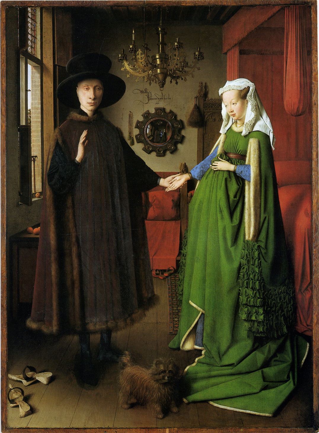
A big part of being a good artist is figuring out what you are lazy about and either dealing with it or leaving it out of the fucking picture. And leaving it out of the fucking picture is not as easy as it might sound. There is a reason I'm calling this Adrian Smith's best picture, a million gremlins of construction and necessity creep into any image (But what's holding the branch up? Wait, what color is the sky?) and learning which "necessary" parts you can do without is as much a challenge in art as in math or engineering or computer programming. No artist can or should be able to draw everything. Turning life (5 senses, 3d, in motion) into a picture (one sense, 2d, unmoving) requires letting go of this effect and choosing that effect, over and over. Asking Jan Van Eyck but where is the movement? What color is the light? Would be missing the point of the choices he made to leave those things out so could use the space he had to show you other stuff. Like the richness and crispness of that green.
4. You couldn't find it anywhere else
A few pre-modern minds could have come up with figures that grotesque, but the combination of the grotesque with the heroic (St George and the dragon have merged) is pure modern. Much more importantly and impressively, though: Durer, Michaelangelo or Schongauer couldn't have drawn it--even if Smith didn't use photo references for the picture, the images show a distinctly postphotographic familiarity with how anatomy responds to action and a level of allegiance to the underlying visual rhythms of a post-machine aesthetic (compared to the flowy lines of nearly everything depicted in mid-air before about 1900). And he applies every inch of that knowledge to the picture, while still doing all the due dilligence of invention on top.
No comic book artist would've done this: the deadlines wouldn't put up with it and the style comic artists develop to make beauty happen while still regularly meeting those deadlines doesn't point people in this direction.
Hollywood hasn't gotten there yet: it requires a dedication to a certain visual niche that, as yet, has not produced its own Greenaway or Kubrick or Ridley Scott.
The contemporary fine art world would, of course, have nothing to do with it: it refers too much to earlier eras of art that are out of fashion there precisely because they have remained in fashion in other parts of the culture--especially ones associated with the lower classes (medieval europe=heavy metal=poor people whereas, say, medieval Chinese art=China=(at least in America) new market!). Plus it has no obvious message--it depicts a war of the terrible against the also-terrible in an eccentric style with cultural antecedents but no cultural references--and so it's hard for the typical critic to analyze: an unsurmoutable bar to entry in the art world.
While someone commissioning an album cover or a picture for a novel might have scraped together enough money to feed an artist for whatever length of time it would've taken to make this picture, it's pretty unlikely. If you saw an image this maniacally constructed on the cover of something meant to advertise itself to a general audience it would probably be because it had been drawn for some other reason and then licensed after the fact. Adrian Smith on a mainstream commercial deadline would come out more like Stephen Gammell.
Point is: if there weren't RPGs, and there weren't therefore the specific mythology of heroic grotesqueries fighting heroic grotesqueries produced by the Warhammer people, there might not have been anywhere else to find the money to pay the artist to produce an image like this. There are not a lot of other patrons, good or bad, that pay for expeditions this deep into territory this remote.
I like RPG art a lot. It gives people an opportunity to show us new stuff we otherwise would not have gotten to see. And that's always good.


15 comments:
I dunno. You know more about these things than me, but the way he's holding that axe just looks wrong. Not so much where he's holding it (though that looks wrong too) but because he is stretching out his arms at right angles in a posey, undynamic way. It doesn't look so much like he's about to swing it, as he is striking a pose and saying to the viewer: "Look at me, at the centre of the picture, and how badass I am!" To my eye, anyway. I still like the picture, though.
"Hollywood hasn't gotten there yet: it requires a dedication to a certain visual niche that, as yet, has not produced its own Greenaway or Kubrick or Ridley Scott."
How about Terry Gilliam? The obsessive level of visual detail in almost every frame of Brazil, for example...which is also extremely grotesque. Not sure his other films quite meet that standard though.
I'm guessing, basically--if you _still like the picture_ then that means the highwire of "holding the axe wrong but somehow right" has been walked.
Like you can probably imagine a situation where he's holding it _so_ wrong you don't like the picture any more or the rest of the picture is composed in such a way that it matters a lot and I'd go "Why don't you like the picture" and you;d say:
"well he is stretching out his arms at right angles in a posey, undynamic way. It doesn't look so much like he's about to swing it, as he is striking a pose and saying to the viewer: "Look at me, at the centre of the picture, and how badass I am!" and that makes it implausible"
I'm not saying he couldn't do a movie that looks like this. I will say he hasn't done it yet.
Unless he's got that angel almost choked out, he's gonna need to do something about the sword coming down on his head. But I think he could maybe use the axe to cut the angel's throat from that grip.
Fair enough!
I think he's already done his best work though. And Don Quixote kind of did him in.
The wrongness of the grip actually enhances the whole thing for me because it suggests brutality, kind of like someone swinging a rifle by the barrel and using it as a club. Like, that's clearly not the best way to use the weapon, but he doesn't care, he's just there to beat the snot out of someone.
I just really like the strong kinetic line that starts with a hoof and ends with a crushed windpipe. And there's enough details to roll around in until you feel the urge to bathe.
Don't study the groin.
Yeah--what Brendan said. It's not that he's holding it far up the neck it's that he's holding it with the blade aligned between thumb and web of the hand forefinger thta makes it weird.
Things would have to have gotten pretty weird to be holding an axe essentially backwards
Zak -- what materials are at use here? Plain ol' pencil on great paper? A few years back I very briefly ventured down the road of silverpoint, but quickly decided that the unforgivingness of the medium would drive me to such depths of suffering, I really didn't want to go there. But the depth of the kind of suck-you-in-detail you can get out of silverpoint, while not being distracting at all, reminds me a lot of the kinds of things you're talking about here. Didn't Durer and Van Eyck both use silverpoint for drawing? I wonder if Smith does, as well?
Adrian Smith is using a pencil here.
Durer made prints, I don't know what the exact process was. Van Eyck I don't know, I only know his paintings
It's a good sketch, but there is much that need to be refined to make it great. The axe is an issue as is the lack of dynamish in the anatomy.
That is the detail is excellent, shows real skill and style. There are problems with form and the overall composition. The style and technique do exude raw energy and that is always attractive in art.
But hey, that's just my view. Art is a large part taste, small part technique.
Post it on conceptart.org in It's Finally Finished and see what they say.
That was vague and weird.
I don't see why I'd post a 20 year old Adrian Smith drawing on some website though.
"I'm assuming that was a good idea mostly because the picture came out as one of the finest pieces of art in history ever"
What other pieces would you put up there, out of curiosity?
Hard to remember them all
Ecstasy of St Teresa
One or two works of Jean Tinguely
The dancing celestial and one of the portrait sculptures of durgha in the Met
Fall of the Rebel Angels
Lucifer by Pollock
some Lee Bontecou sculpture
portrait bust of scipione borghese by finelli
that William Eggleston photo of the guy and the rocket
Garry Winogrand's picture with the hippos
A few of the other drawings in Realms of Chaos
"The ghost of Genta Yoshihira" by Yoshitoshi
that: http://lebbeuswoods.files.wordpress.com/2010/03/5a1.jpg
Makoto Kobayashi's Bound Dog gundam drawings
one of the Simon Bisley doom patrol covers
that egon schiele drawing with the girl with the patterned fabric hanging off her
paolozzi's collages
lots more, really, too
Post a Comment