Design is another:
 |
| Click to enlarge |
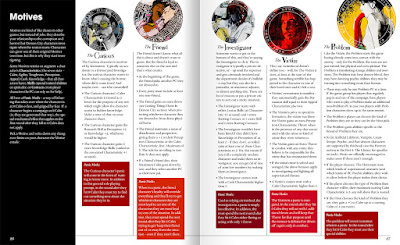
Those of you who've been paying attention to the blog recently may have noticed the one-man-force-multiplier named Shawn Cheng dropping layouts for the new project.
 |
| from Shawn's site |
That mix of detail and dreaminess is just. I don't know. Cheng does things I can't and I love it.
This is Shawn's D&D character sheet, I'm pretty sure Nemo's been around since like 2009...
...he kicked some ass in Frostbitten & Mutilated last time I was in NYC. Shawn has a ton of these character sheets and the instinctive design sense even in these casual little things is depressing for a "fuck where do I cram this in?"guy like me. He even gets the horse in there. Like porn, it's a lot about knowing where to put things.
It's weird to think how long we've been working together, he did my very first coffee table book...
Even though I usually have some real specific ideas about how I want my projects to look, its those moments where we click together and he goes above and beyond that make design go from good to great. You find where the overlap of your sensibilities matches the projects own energy, you can give fewer and fewer directions and just let them go nuts. I sent a lot of reference images for Demon City--japanese and 80s horror posters mostly--but, oddly, I think when the design for Demon City really took off is when I started sending Shawn old Atari ads...
...the stuff coming back stopped being "Hmm, but can we do..." and started being "Oh holy fuck yeah".
There's some kind of aesthetic of panic in there--and also Atari and early video games in general involved graphic designers in trying really hard to use every tool of the trade, largely because they were trying to sell green squares on a black screen.
I've probably collaborated with Shawn more than anyone else over the years, and I know when we get in the zone, he delivers something and you "Oh, beautiful, perfect.."
...and you show it to people and they're like "Oh cool!" then a few weeks later he goes "Nah wait I think I can do better...."
Demon City is a modern world and the modern world, much more than the D&D one is designed, every inch...
So on this project, the design is as- or nearly as- important to the world-building as the art. Once they feel like you're inside the the world, a GM can start to spin things out of it on their own. And I knew Demon City needed someone who wasn't afraid to make the book's total package into a little brain-bomb.
Although he may not be a familiar name to some of you, he's actually been OSR-adjacent for quite a while. One of the first things gamelike projects I ever did was the collaborative "battle blog" Road of Knives with Shawn and Nick DiGenova. In RoK, Shawn would draw a thing...
And then I'd draw something punching it...
...and then he'd draw someone punching them..
..and back and forth forever...
It was advertised in an early OSR zine, I think it was Matt Finch's? Anyway a lot of the game-like thinking that turned into this blog started there.
Anyway, part of what makes a big project cool is pointing the spotlight at other talented people, and getting to work with them, and as soon as Demon City was funded monday that me and Cheng got to work together again on something like nobody's ever seen before, I hope you have as much fun with it as we're going to.
 |
| Throw down for the Demon City Kickstarter here |


3 comments:
This is a great post. You bring the fire and Shawn brings the gasoline.
shawn's art is gorgeous and nemo looks like he could fit right into One Piece
A quick note on a typo in the third line/third sentence of that Demons of the 3rd Order description; "TheY eat /.../"
And now I go to bed, hoping the three threes above have not unlocked something ...
Post a Comment